URL and Domain Configuration
Default Dashboard URLs
Every dashboard starts with a unique, randomly generated URL: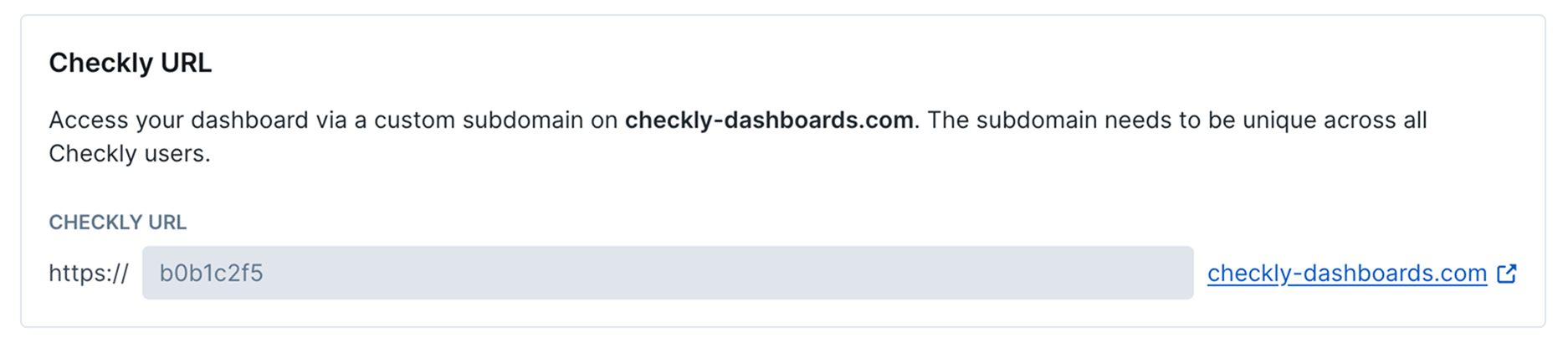
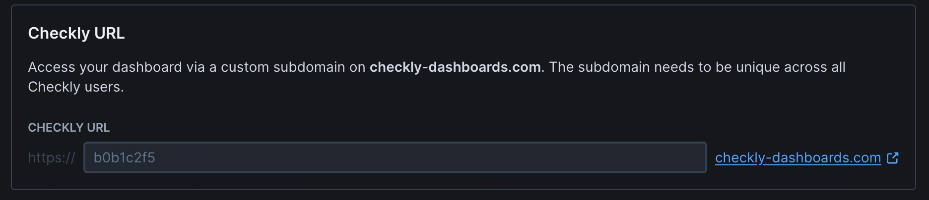
Custom subdomains must be unique across all Checkly users. Choose something specific to your organization to avoid conflicts.
Full Custom Domain Configuration
Use your own domain for maximum branding control and professional appearance: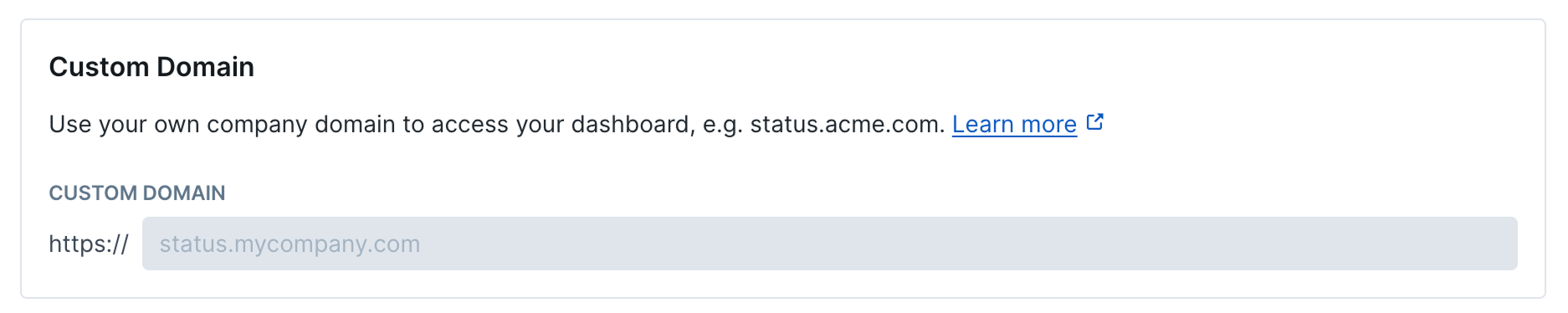
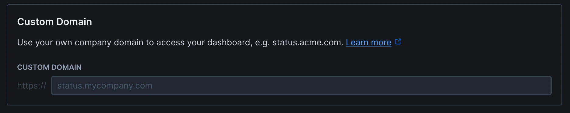
Required DNS Records
Look and Feel
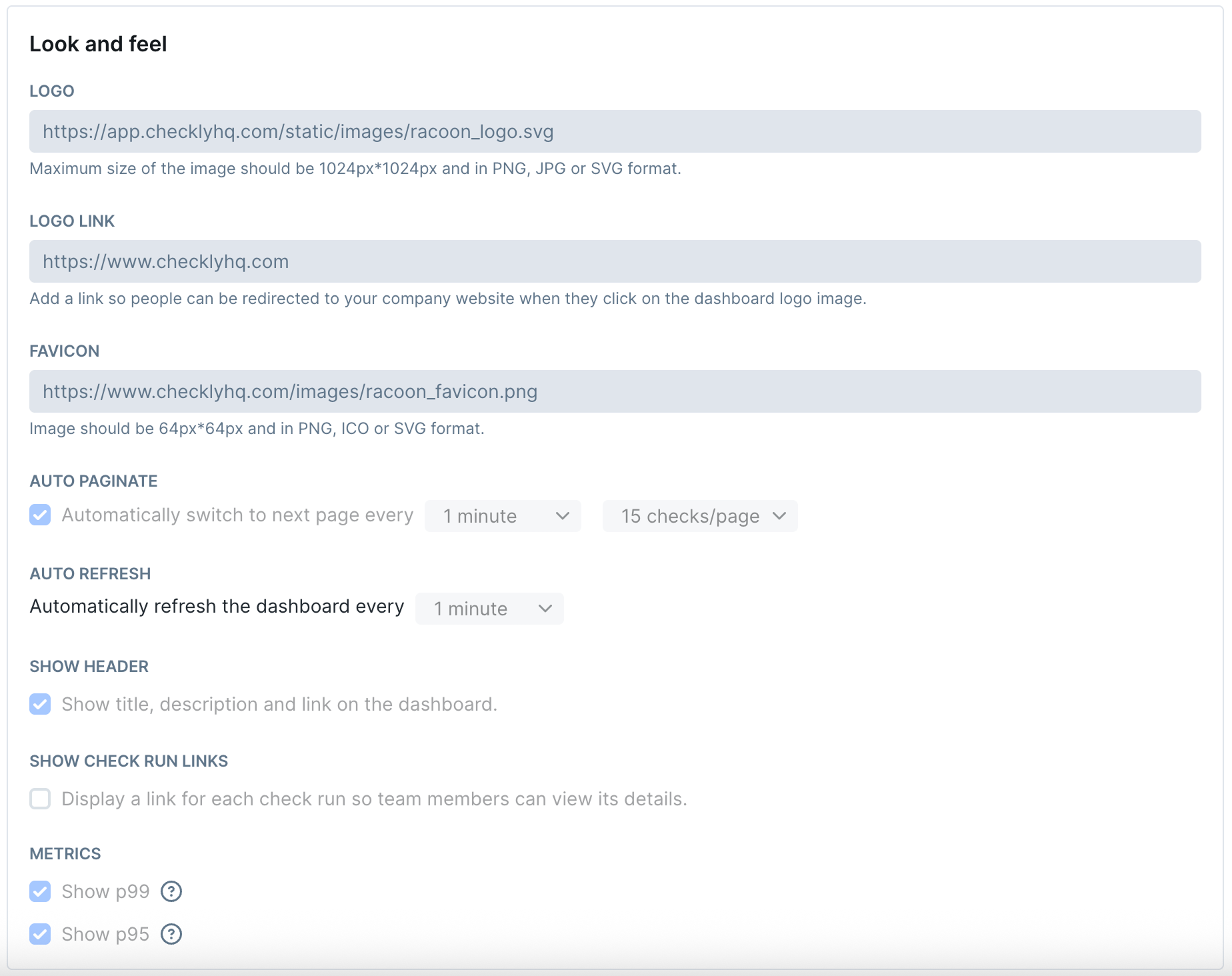
Logo
Upload your brand logo to personalize the dashboard header. The logo image supports PNG, JPG, and SVG formats with a maximum size of 1024px×1024px.Logo Link
Add a clickable destination URL for your logo. When visitors click the logo, they’ll be redirected to your specified website (typically your company homepage).Favicon
Set a custom favicon for browser tabs and bookmarks. The favicon should be 64px×64px and in PNG, ICO, or SVG format for optimal display across browsers.Auto Paginate
Automatically switch between dashboard pages when you have multiple pages of checks. Configure the timing interval (1 minute default) and number of checks displayed per page (15 default).Auto Refresh
Set automatic dashboard refresh intervals to keep status information current. Choose from 1 minute, 5 minutes, or 10 minutes based on your monitoring needs.Show Header
Control whether the dashboard displays the header section containing your title, description, and logo. Useful for clean, minimal status displays.Show Check Run Links
Enable or disable clickable links on check results that allow viewers to see detailed check run information and logs.Metrics
Display performance metrics on your dashboard:- Show p99: Display 99th percentile response time metrics
- Show p95: Display 95th percentile response time metrics
Advanced CSS Customization
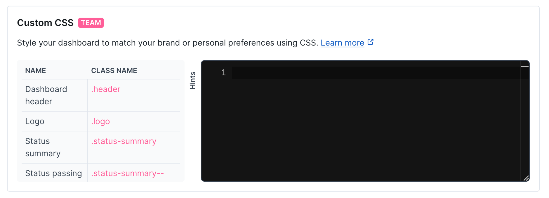
CSS Editor and Tools
For Team and Enterprise plans, unlock complete design control:CSS Classes
The following table lists the CSS classes available for customizing your dashboard appearance:| Name | Description | Class Name |
|---|---|---|
| Dashboard header | Main header container with logo and title | .header |
| Logo | Company logo display area | .logo |
| Status summary | Overall status overview section | .status-summary |
| Status passing | Green status indicator styling | .status-summary--passing |
| Status failing | Red status indicator styling | .status-summary--failing |
| Main content | Primary dashboard content area | .main |
| Incidents summary | Incident overview section | .incidents-summary |
| Check | Individual check card container | .check |
| Check result | Check status result display | .check__result |
| Passing check | Green check status styling | .check__result--passing |
| Failing check | Red check status styling | .check__result--failure |
| Degraded check | Yellow/orange degraded status styling | .check__result--degraded |
| Check metrics | Performance metrics display area | .check__metrics |
| Check list | Container for all check cards | .check-list |
| Empty check list | Styling for when no checks are present | .check-list--empty |
| Time range | Time period selector container | .period |
| Active time range | Currently selected time period | .period--active |
| Time range selector | Time period dropdown/selector | .period-selector |
| Pagination | Page navigation controls | .pagination |
| Incident | Individual incident display | .incident |
| Incidents page | Full incidents listing page | .incidents-page |
| Incidents detail page | Detailed incident information page | .incidents-detail-page |
| Incident list | Container for incident listings | .incident-list |
| Incident list date | Date headers in incident lists | .incident-list__date |
| Active incident list | Currently active incidents container | .active-incident-list |
| Active incident card | Individual active incident display | .active-incident |
| Major incident | High priority incident styling | .active-incident--major |
| Minor incident | Low priority incident styling | .active-incident--minor |
| Incident header | Incident title and metadata area | .active-incident__header |
| Metric | Performance metric display | .metric |
| Metric improved | Positive metric change styling | .metric--improved |
| Metric worsened | Negative metric change styling | .metric--worsened |
| Metric badge | Metric value indicator | .metric__badge |
| Dashboard footer | Footer area with links and branding | .footer |
| Error 500 | Server error page styling | .error-500 |
| Error 400 | Client error page styling | .error-400 |
| Login background | Login page background area | .login-background |
| Login box | Login form container | .login-box |
| Login input | Login form input fields | .login-input |
| Login button | Primary login button | .login-button |
| Login social button | Social login option buttons | .login-social-button |
| Logout button | User logout button | .logout-button |
| Logout icon | Logout button icon | .logout-button__icon |